The most important thing when creating Landing Pages is to build trust, especially if you are targeting fresh traffic users or doing prospecting campaigns. You need to give the user confidence that you are a legitimate business and that you can be trusted.
I want to present nine of the most important elements in my opinion when building trust on your Landing Pages.
- SSL Certificate
- Reviews
- Badges
- Contact Information
- Show Your Product
- Social Proof
- Be Clear
- No Grammar Mistakes
- Professional Design
- SSL Certificate – it basically means that the connection between the user’s computer and the server is secure. There are a lot of SSL certificates around and you don’t have to be a tech savvy guy to install a SSL Certificate on your website. This is something really easy to do and it builds a lot of trust. In particular, now when Chrome notifies the user “Do you really want to go to this website? Because this website is insecure” .SSL Certificate on your Landing Page is really important.
- Include Reviews – The next one is from VWO where they included a review from Brandon and it gives me trust because I know that Brandon is a Director in Warner Music Group. I have his name, I have his position, I see his face. This builds trust because his personality can resonate with the users – I have a similar position should I be using their product? You also don’t have to put a lot of reviews. One is enough, two are fine, three is getting excessive, four you overdid it!
- Badges – This is the easiest one here. You can include badges of your partners, clients,the technology you use. When designing your landing page try to include them above the fold. It’s a device-agnostic feature. Try to position it similarly on both devices. happens if you include the badge or the company like Siemens. I had a Siemens phone in2004, so I know and trust this brand. So now I have this trustable brand and this trust resonance with the company that uses the logo. A very easy example here is using Mastercard, PayPal, Visa logos if you are using them for payment, this is something that basically everyone can use. And there’s a lot of examples of other badges that you can use on your Landing Page.
- Contact Information – If I arrive at Landing Page of a company that doesn’t put where it is from I’m not very sure if I want to trust them. However, if they add info in the footer “our headquarters are Berlin” and there is a specific street and a phone number I can definitely trust them.
- Show how your product works – show the user that the product is ready to use and, how can they use it. I try to use videos instead of just text because videos are a lot more interactive. Users can just jump from here to there and see the parts they want and at the same time, we educate them about our product.
- Social proof – means that other users tested your product and are happy with it, This is from Zoho mail. So showed the star ratings of the App on different websites. They confirm there’s a lot of users who already use this App and that they are happy with it.. You can also use Facebook likes, Instagram followers, for example, if we have 10,000 Instagram followers, 10,000 paying customers or 10,000 satisfied customers or any other number that is significant to your business.
- Be clear – I also mentioned to be clear. First of all focus only on one specific action on a Landing Page. Don’t ask for email, and at the same time invite the user to test your tool or buy it. It just creates confusion. Just be clear – If you want the e-mail just ask for the email, if You want a phone number, just ask fora phone. Clarity builds trust.
- No Grammar Mistakes – I remember landing pages with grammar mistakes from a client of mine. The first time I read through the page I noticed the error it really confused me, so if I saw this, anyone else could see this too. When a user that does not know our brand enters and sees grammar mistakes this torpedoes the trust we build with all other elements. If you are bad with grammar, find a copywriter to do it for you. This is crucial to building trust. Don’t forget to also always check your landing pages with a native speaker before going live.
- Professional Design – when you arrive on the website and the images are not aligned, the texts use five different fonts and it just seems esthetically uneven you can get doubts about trusting this company. Currently, there are TONS of good Landing Page builders with pre-made templates that you can use and just customize. This is the way you should do this if you don’t have a graphic designer. Use ready templates and customize them. Sometimes you will need to make compromises on the design part but it will save you a lot of money.
To summarize, we have nine key elements to building trust on Landing Pages. Some are more important than others but in general, try to use at least five on your website. This will help you build trust and will increase your profits.
Landing Page Review #LPR
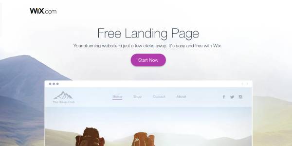
Now we are going to a quick overview of four landing pages to see which ones are using trust elements. The best way to find inspiration for well-designed Landing Pages is highly competitive SaaS niches. In my particular case, I selected the “Landing Page Creator industry” and reviewed wix.com, Unbounce.com, mailchimp.com. I encourage your to watch the video where I go into more detail.
Wix.com – Landing Page Review
What’s there:
- SSL Certificate
- Professional Design
- Be clear
- No Grammar Mistakes
On this landing page, WIX uses a few trust elements, which in my opinion are not enough to build sufficient trust for a new user to convert. I definitely see a lot of options to improve here.
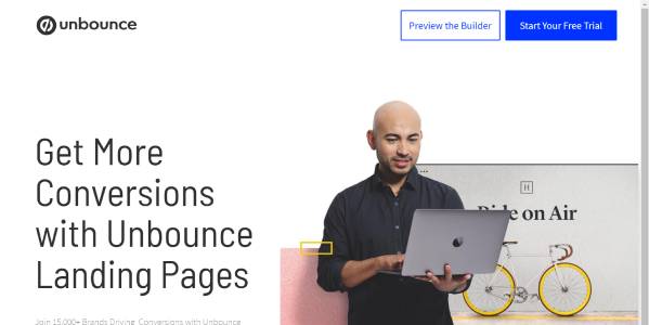
Unbounce – Landing Page Review
What’s there:
- SSL Certificate
- Professional Design
- Badges
- Review
- Show your product
- No Grammar Mistakes
We see Unbounce use six out of nine Trust elements I mentioned and I definitely think they are doing the correct thing. There are a few points to improve, like for example add a heading to the badges saying “These agencies trust Unbounce”. A next point to potentially improve are social proof elements like number of clients they have, the number of successful Landing Pages created this year or similar. There are a lot of possibilities here to do this. Another thing are the confusing buttons that distract the user. I recommend keeping it as simple as possible and sticking to one call to action.
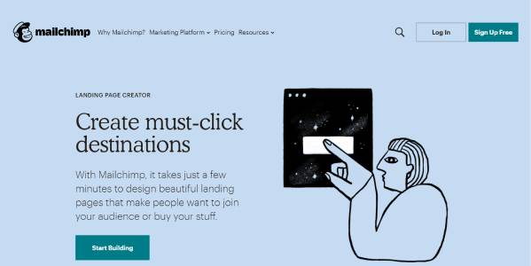
Mailchimp – Landing Page Review
What’s there:
- SSL Certificate
- Professional Design
- Review
- No Grammar Mistakes
- Contact Information
Mailchimp had enough trust elements to convince a new user they are a legitimate brand. I like including a video review to strengthen the message, they also have a clear Call to Action but at the same time there are so many issues with this page that I think it is very difficult for fresh traffic users to convert. This means the navigation is distracting with some many link to other sections, then they don’t really focus on one call to action but redirect the user to other sections of their website. They also cover additional functions that might not be so important to New users. In the end, they try to sell more than just a landing page builder which is possibly more that a client wants. I would definitely want to test a simpler version of this landing page to see the results when we eliminate the distractions.
VWO – Landing Page Review
What’s there:
- SSL Certificate
- Professional Design
- Review
- Badges
- Show your product
- Social Proof
- No Grammar Mistakes
- Be Clear
This is a landing page from a different industry but I wanted to include one landing Page that includes trust elements in an exceptional way.
On the first screen when we enter the page we already have a Review/Social proof showing us the results someone has with their tool, next we see how their product work with detailed features and images.
Below there is a review from a customer. Please try to include a photo, position, and company because it builds more trust when we can see a person and not just a random quote from a person working at a company we don’t know. If the position is relevant it even builds more trust because the user reading the review can relate.
Below are the badges from companies that use their tool. And as mentioned previously the more known the brand the better but even if we don’t know the brand we can just include a logo and say what the brand does. For Example:

Below we have social proof elements saying the number of experiments carried out in 2018. I like this but it definitely should be updated for 2020 – 2018 seems like ages ago!
The one thing that definitely could be improved here is including some form of contact information in the footer saying where the headquarters are. This could also build additional trust.
Summary
In the beginning, we went over trust elements, then we did a quick landing page review and saw which trust elements companies use in real life. The aim of this article is not to critique companies but to show you the different possibilities there are currently to build trust on landing pages with even an unknown product. I hope that in the future you will pay more attention to including trust elements on your website.
Share this article with your team and they will thank you the next time you need to work with a client’s Landing Page.


